Dealing with Insurance has never been easier.
Canadian Direct Insurance is a wholly owned subsidiary of Ping An Insurance (Group) Company of China, Ltd. is a Chinese holding conglomerate whose subsidiaries mainly deal with insurance, banking, and financial services. The company was founded in 1988 and is headquartered in Shenzhen.
Role
Role: Graphic Designer, UX & UI Design
Methods and Tools: Surveys, Sketches, Photoshop
Practices: User Research, Prototyping
We wanted to create a website portal for new and existing clients to be able to see all of their insurance information with ease. We wanted users to be able to quickly get new quotes, update existing claims and even book an appointment with a broker.
Note: For this case study, I am not going to cover the entire website experience of the users. I will be addressing the issues faced by the users and the features we wanted to roll out to help facilitate the claim process.
The Problems
We wanted to focus on ease of use, while decreasing bounce rates. The site was performing decently enough, but recent drops in conversions we wanted to start the discussion about upgrading the website.
Some pain points uncovered when reaching out to brokers were:
Getting through the journey was tedious:
Bounce rates were increasing on a month to month basis, anywhere between 12% to 17%. The process was too lengthy and we asked too many questions, too soon.Confusion when trying to figure out missing claim documents:
It wasn't totally clear which documents were needed or which ones were received. This led many delays in the process.Unable to reach a broker to discuss products:
Users wanted an easyway to book at their convenience as they were caught paying phone tag quite a bit with their preferred broker.
Goals
Creating the envisioned website was no small feat, so we would in steps. Sucess for this step was to have a working prototype with the first batch of features identified below.
We also wanted to set a strong foundation for the website so that future features can be added and with increased marketing and a new landing page we wanted to increase conversions.
Access their insurance documents
More efficient follow-ups
Access insurance documents
Contact their broker
Demographic
We wanted the website to be easy enough for older users to navigate. They made up a significant chunk of our demographic and if we could keep them saitified with the experience, it would be a cakewalk for everyone else.
We also wanted to push mobile as 73% of our users were visiting our site on mobile, so everything had to be well packaged and easy to use.
The three main comonalities:
Regular users who didn't want a completely different experience.
Users who had little to no knowledge about Insurance
A growing mobile demographic
Defining the process
We asked ourselves a few questions before starting:
- How do we make getting coverage hassle free for the user?
- How can we make booking an appointment something a user can do within minutes?
- What causes frustration in a frequent user which can negatively affect their experience?
- Are we asking them too many details during the sign up process?
Discovery & Analysis
In order to learn more about the needs of my users i took the following steps:
- An analysis of the existing process of getting insurance on the site to find potential usability issues.
- Competitive analysis to understand common trends and best practices for the questionnaires and branching qualifying surveys.
- Interview sessions with brokers and customer to understand the problems they are facing when dealing with their current insurance company.
- Submitted a prototype to a closed group of stakeholders and selected brokers to go through the new process for valuable feedback to optimize the process.
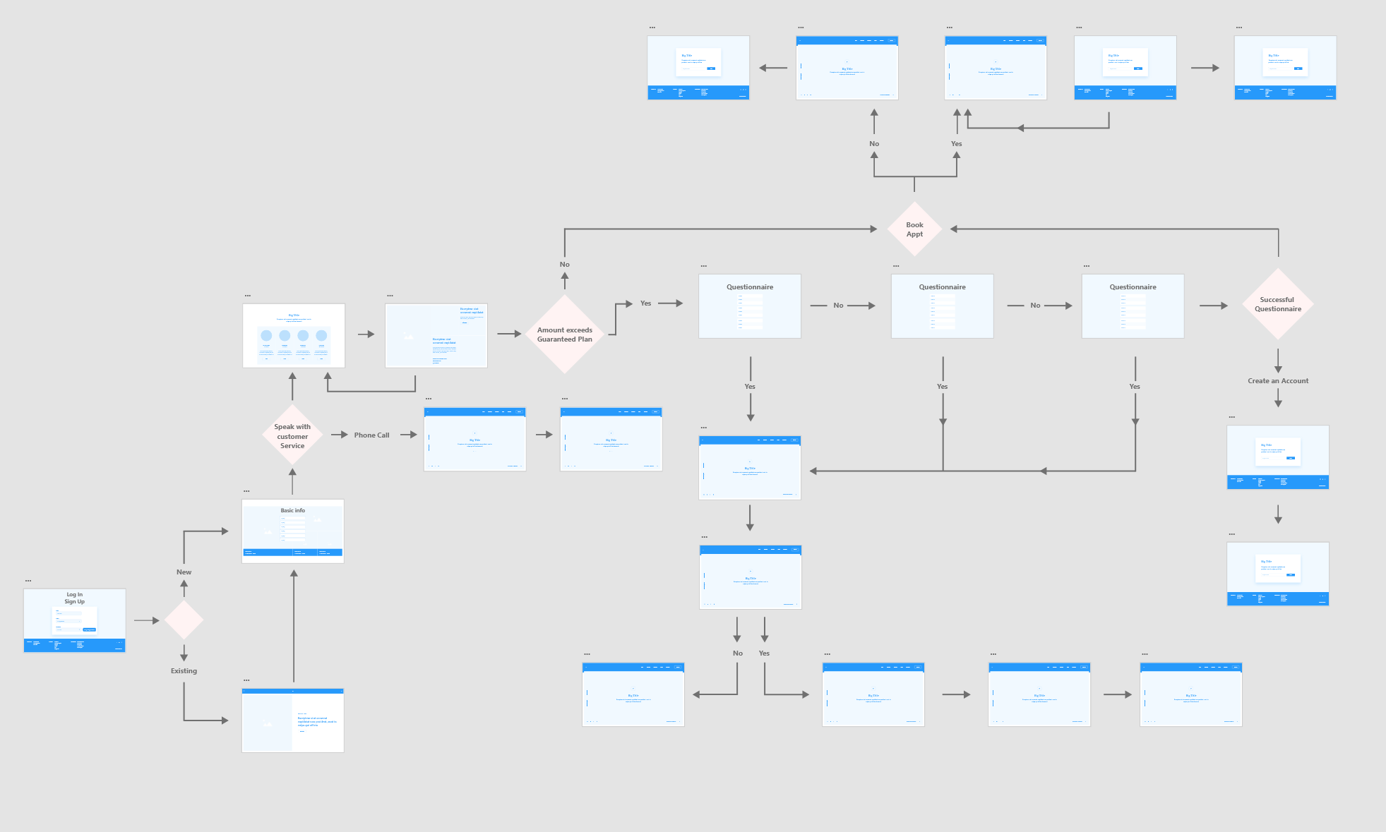
Journey mapping
The journey maps helped visualize the new process that a user goes through in order to accomplish their goal. They also helped me consider the structure and layout that would be necessary for specific screens.
Sketching & Wireframing
With wireframing, trying to iron out details of the experience and find any additional pain points that may not have come up during initial planning. I then refined what would be the final look, feel and branding of the website.
The Solutions
End results
Results of the prototyping in a closed group of 50 test users showed us the following:
- Breaking up the questionnaire into smaller chunks helped increase conversions by 11%.
- Online booking was favoured 3 to 1 over telephone booking.
- Users felt more secure on the site resulting in an increase of 8% in cross sells.
Design implementations
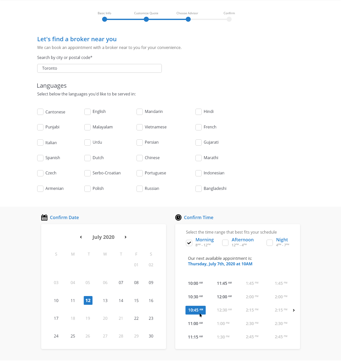
Online Booking
After gathering basic information such as which product and coverage amount they wanted we gave users the option to pick their preferred location and language for their appointment as well as date and time that was most convenient for them.
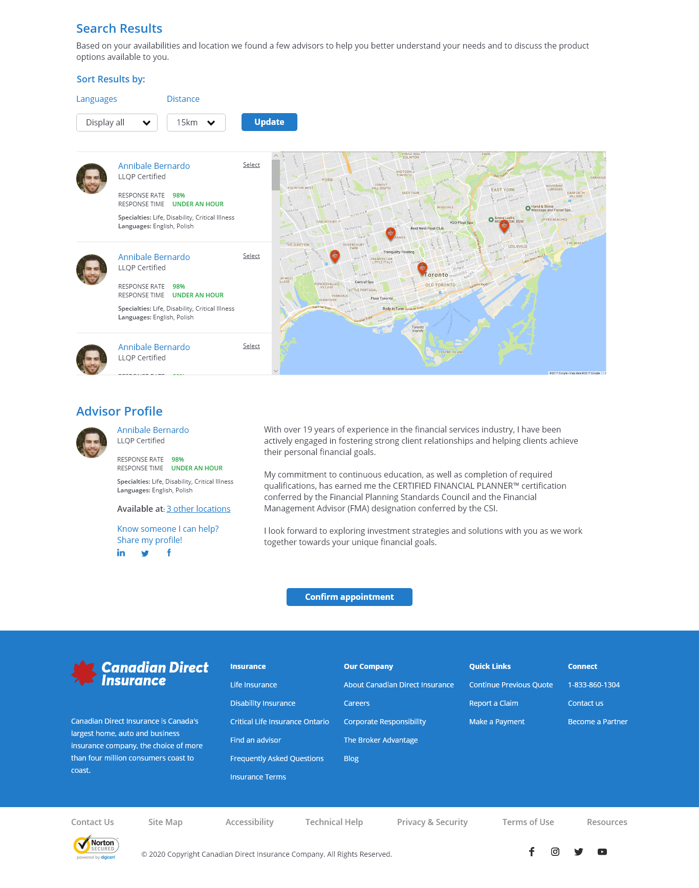
Choose your broker
We then presented users a list of brokers they could meet with based on their parametres. Using our ratings and review system they can then select the broker who best suited their needs.
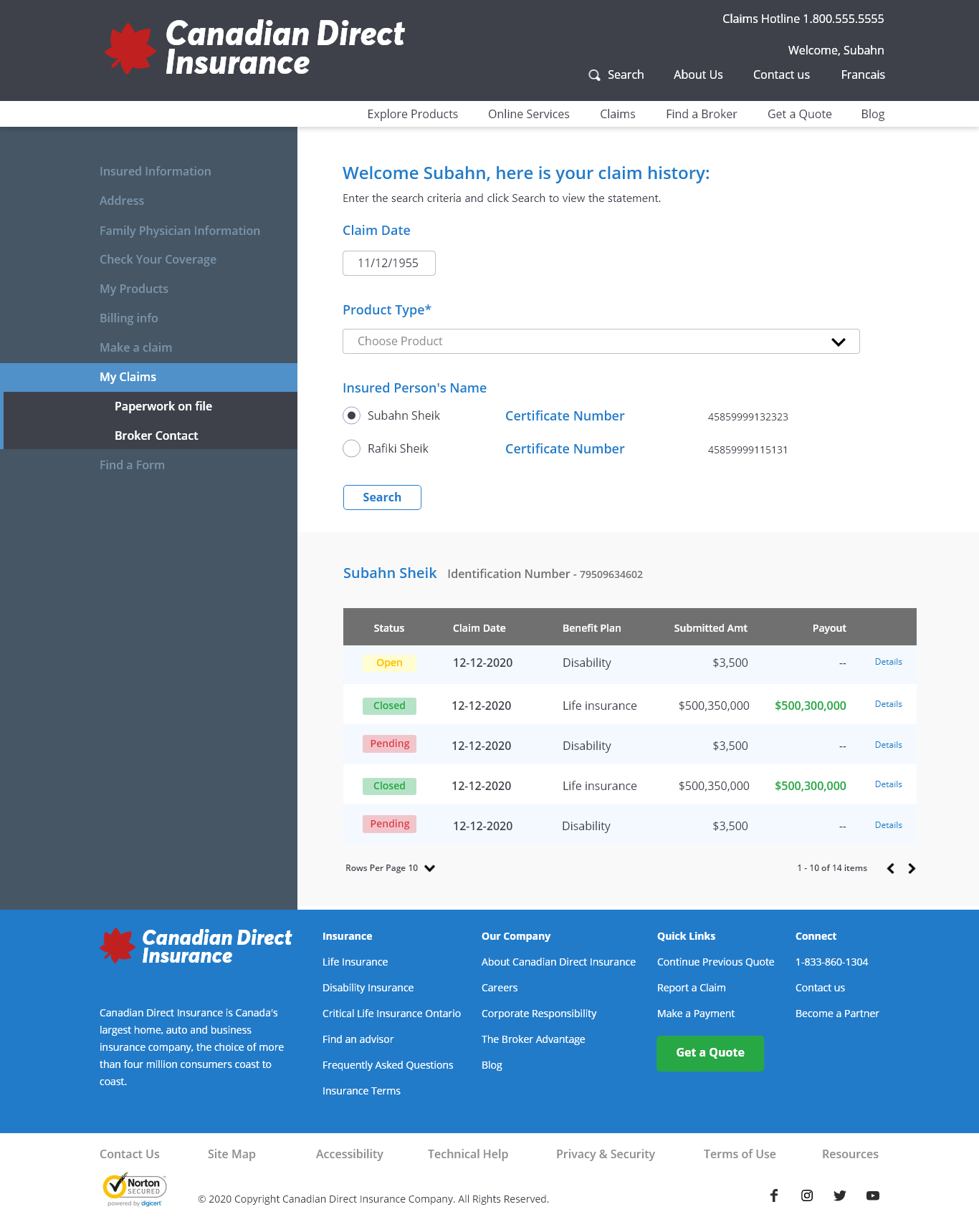
My Account
At a glance we gave users the power to quickly:
- See the products they had
- Start a claim
- Change their billing information
- See which documents they were missing for an existing claim
- Update their physician information
- Contact their broker or share their information via social media
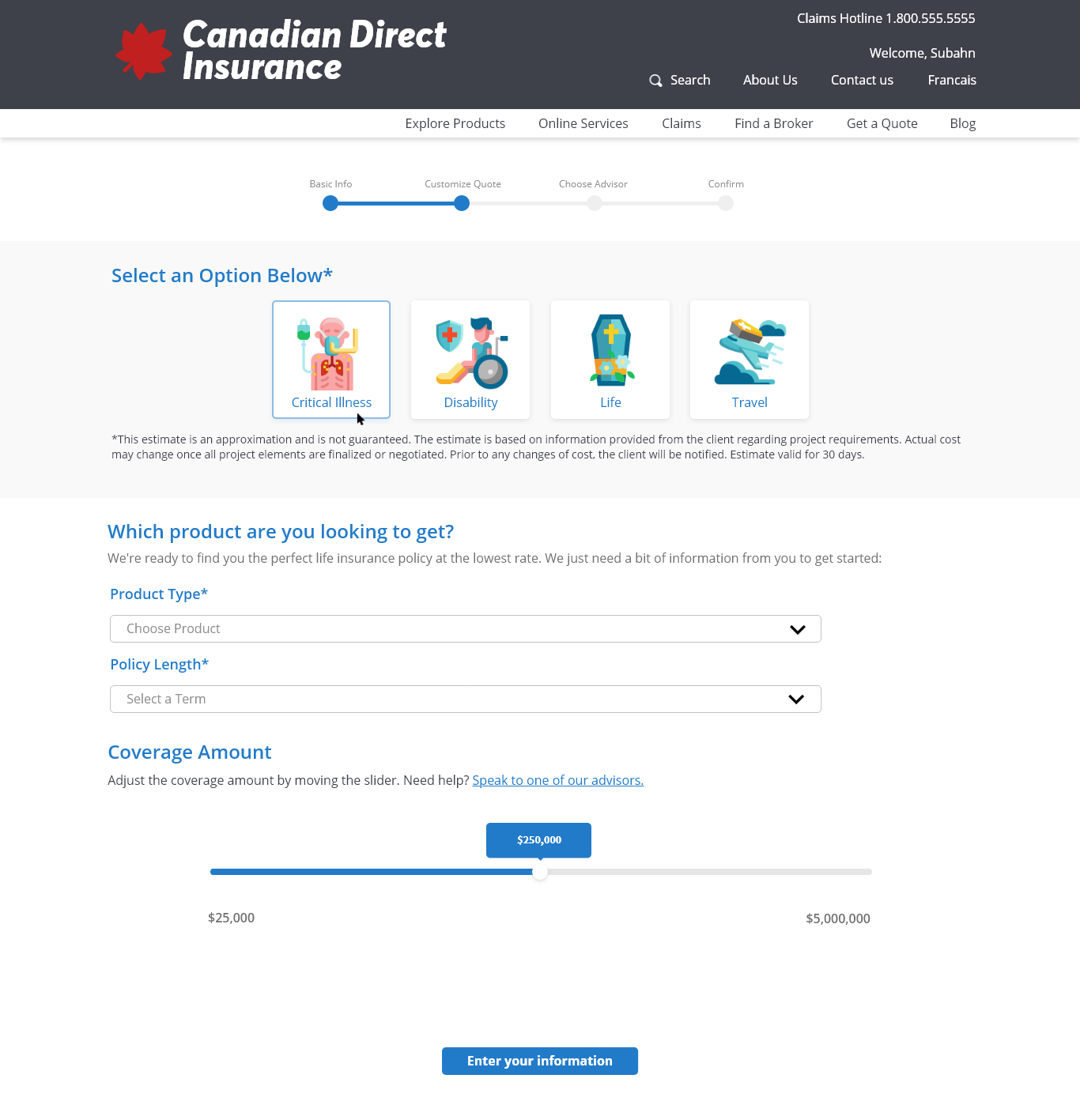
New Quote
Getting a new quote for an additional product was as easy as confirming your existing information prepopulated in your application, choosing the product and the amount of coverage you wanted.
If the application needed a broker appointment the system would take you to the appointment screen.
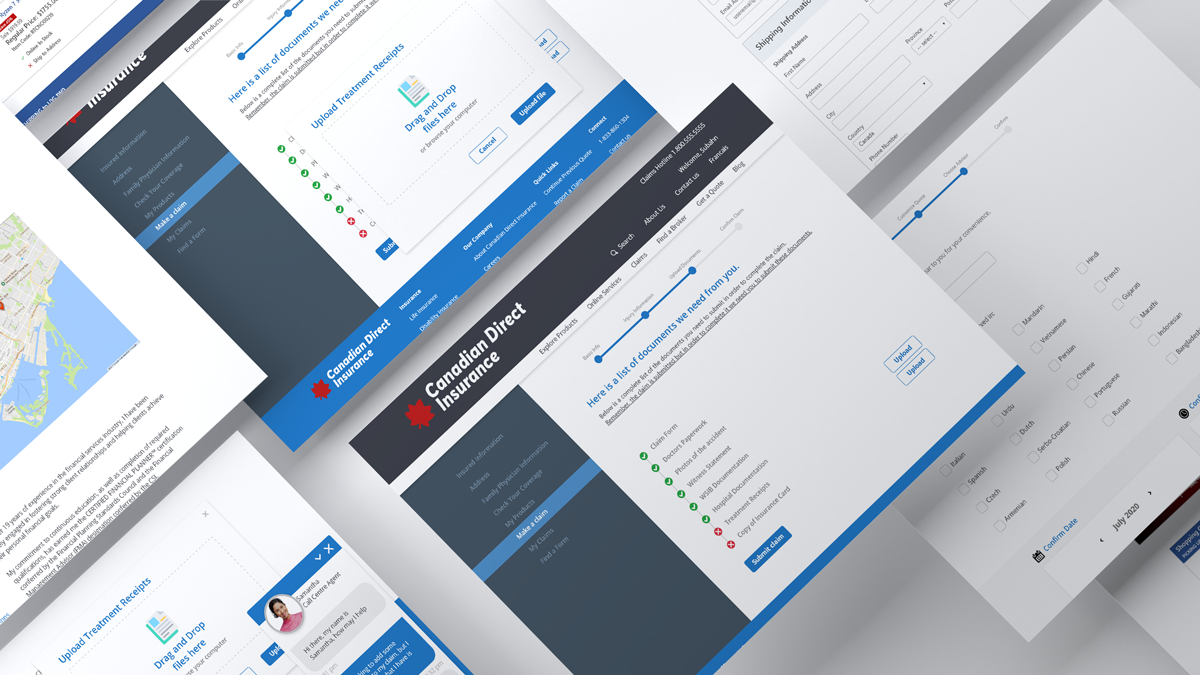
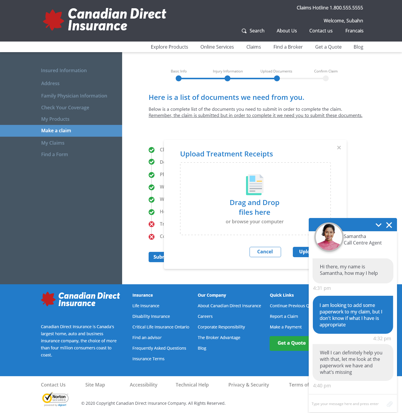
New Claim / Live Chat
When creating a new claim, users would confirm basic information, enter in the details such as injury type and hospital information, and get a claim number assigned to them right away.
We offered a checklist of documents they needed to submit digitally and we would let them know of any that needed to be mailed in physically.
We also wanted to implement a chat function for any questions users may have while going about their tasks.
Conclusion
What limitations did I have to work with?
The big challenge with this project was scope creep and dev time. The more solutions we found the more features we wanted to implement. So it was about managing expectations to have an MVP we could deliver on time.
Working closely with the devs I was able to identify and then work around technology, budget and manpower limitations and develop a solution that was streamlined and solved our problems.
Lessons learned:
I learned that the initial research, determining the target audience then tailoring the experience to that demographic was key. We had a slew of features that we wanted to roll out but had to hold back as they would most likely cause a drop off of usage in the website.
Contact Me
Let’s connect and talk about what I can do for you. Email me at petersonpatrickjoseph@gmail.com.
Download my resumé for more detailed version of my work history.